Week 12
Frank and Oak is woke

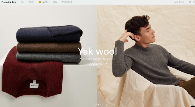
www.frankandoak.com has my favorite type of graphic design: photography-forward with a clever use of type and grids. They have such beautiful stylized photography and a cohesive style. They have clothes to buy and also these subscription boxes. I haven't seen many companies try to pull of both of these models. The UX feels so intuitive that I am able to focus on the imagery and quality of the product, with an invisible minimal touch of design. So nice.


Frank and Oak is woke


Arngren oh my! I couldn't wait to dive deeper into this site: www.arngren.net

I mean, it is like an art piece. Look at the color and different products. It makes me think of my artist friend's work Case Simmons below:

Let me play with Arngren and give it a chance. Omg, I clicked the airplane link and I went even deeper:

Looks like I want to buy a tank, here's the page:

I tried to buy this tank and went here:

Okay, I give up, this is the opposite of UX. This is my EXit.
Comments
Post a Comment